Cosmic Fishing
Client
Cosmic Fishing Theatre
Services
Branding
Summary
A rebrand for an experimental theatre company, built around a logo that hides a planet and a fishing hook in plain sight.
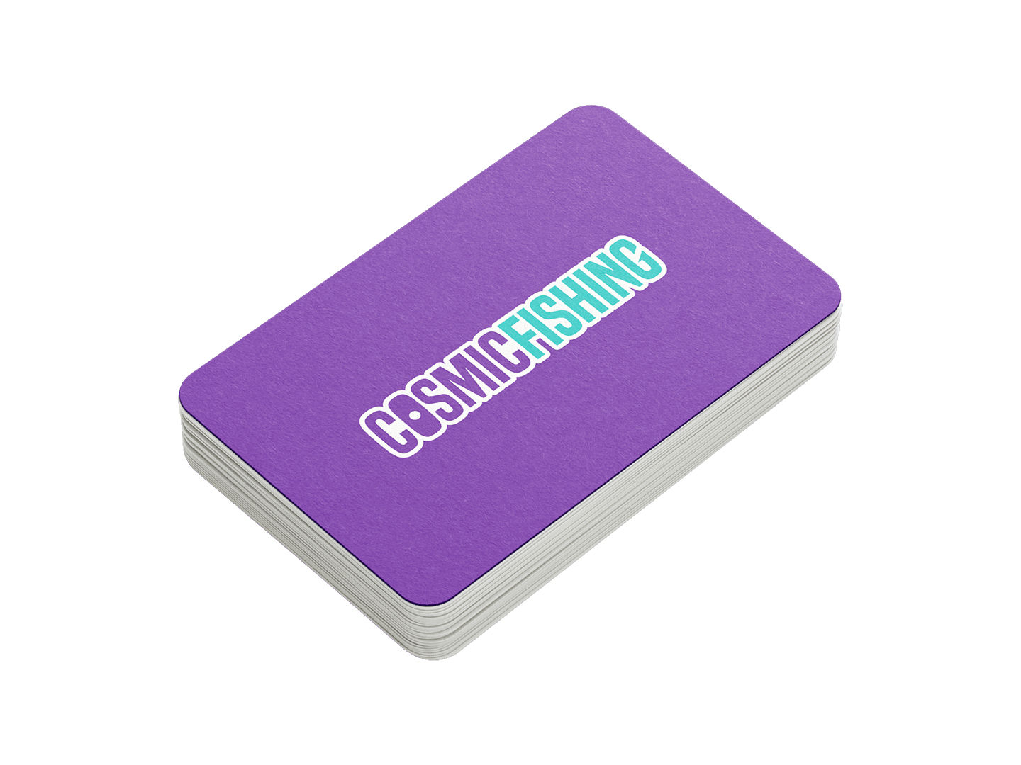
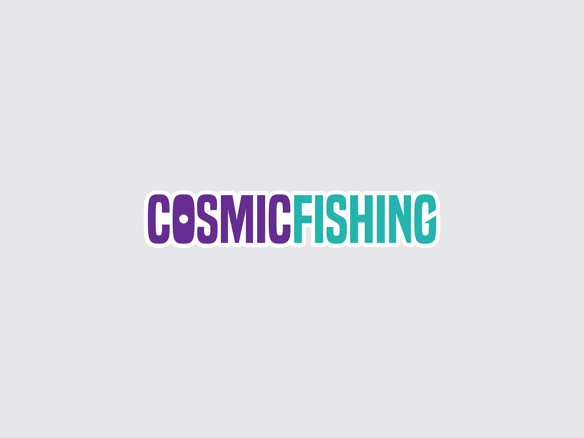
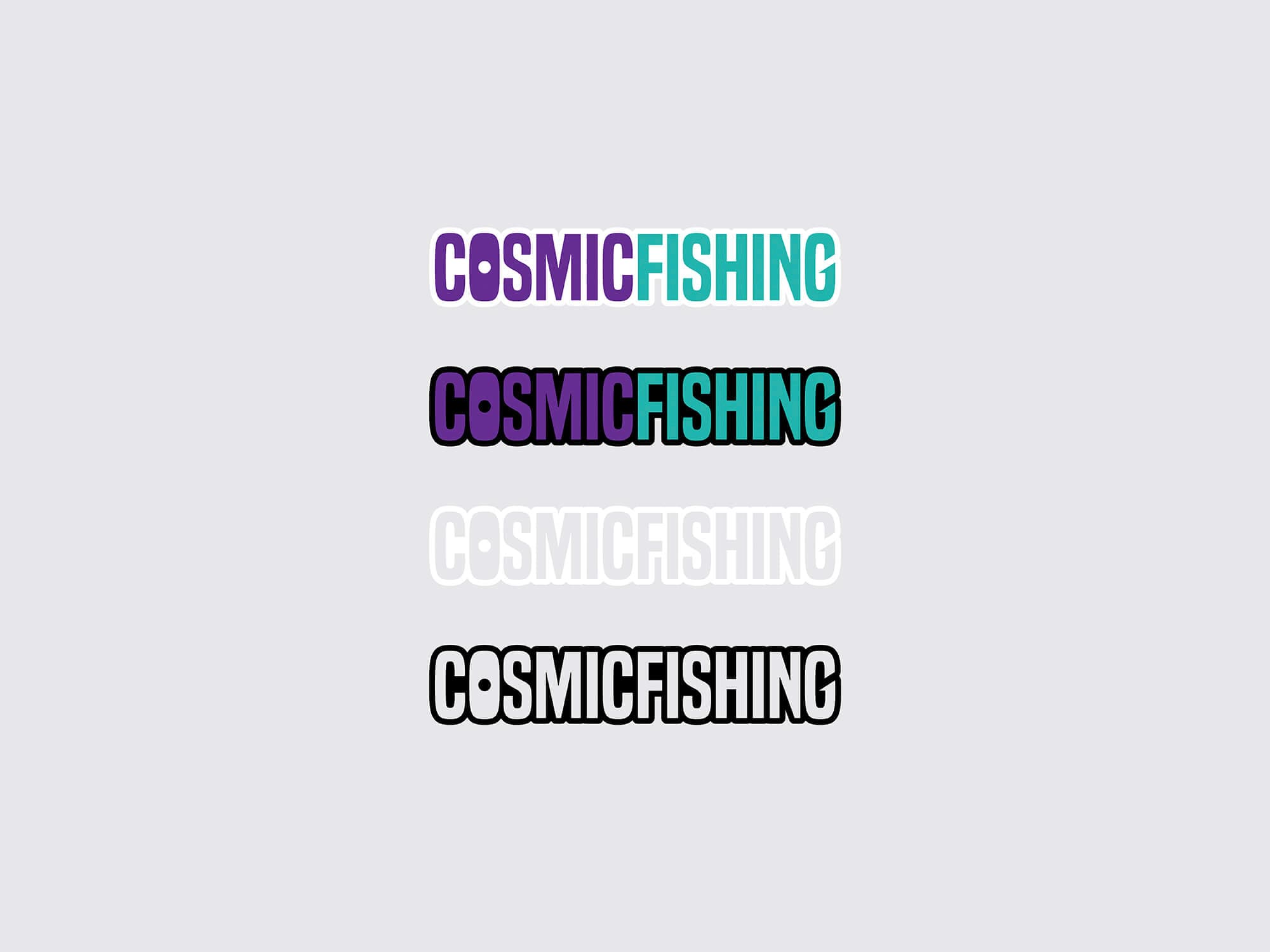
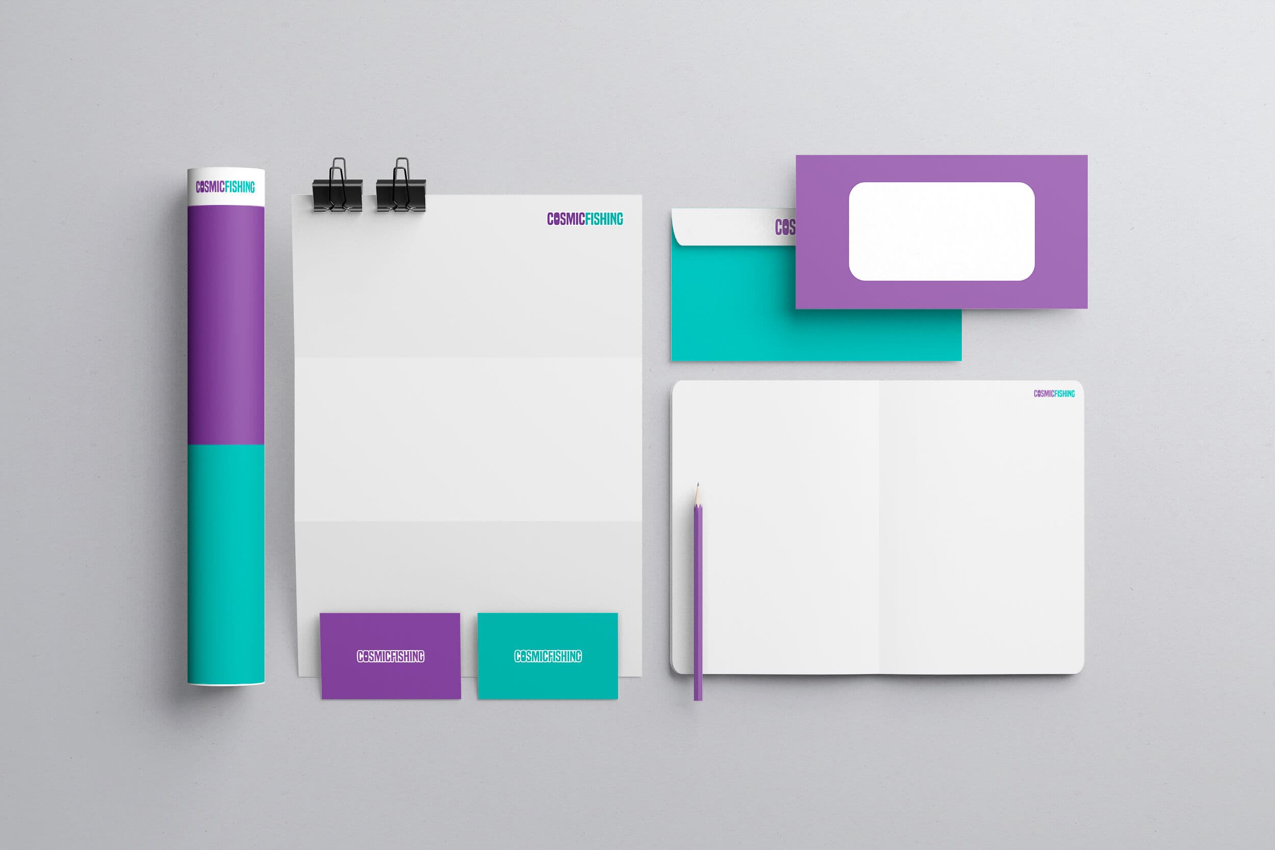
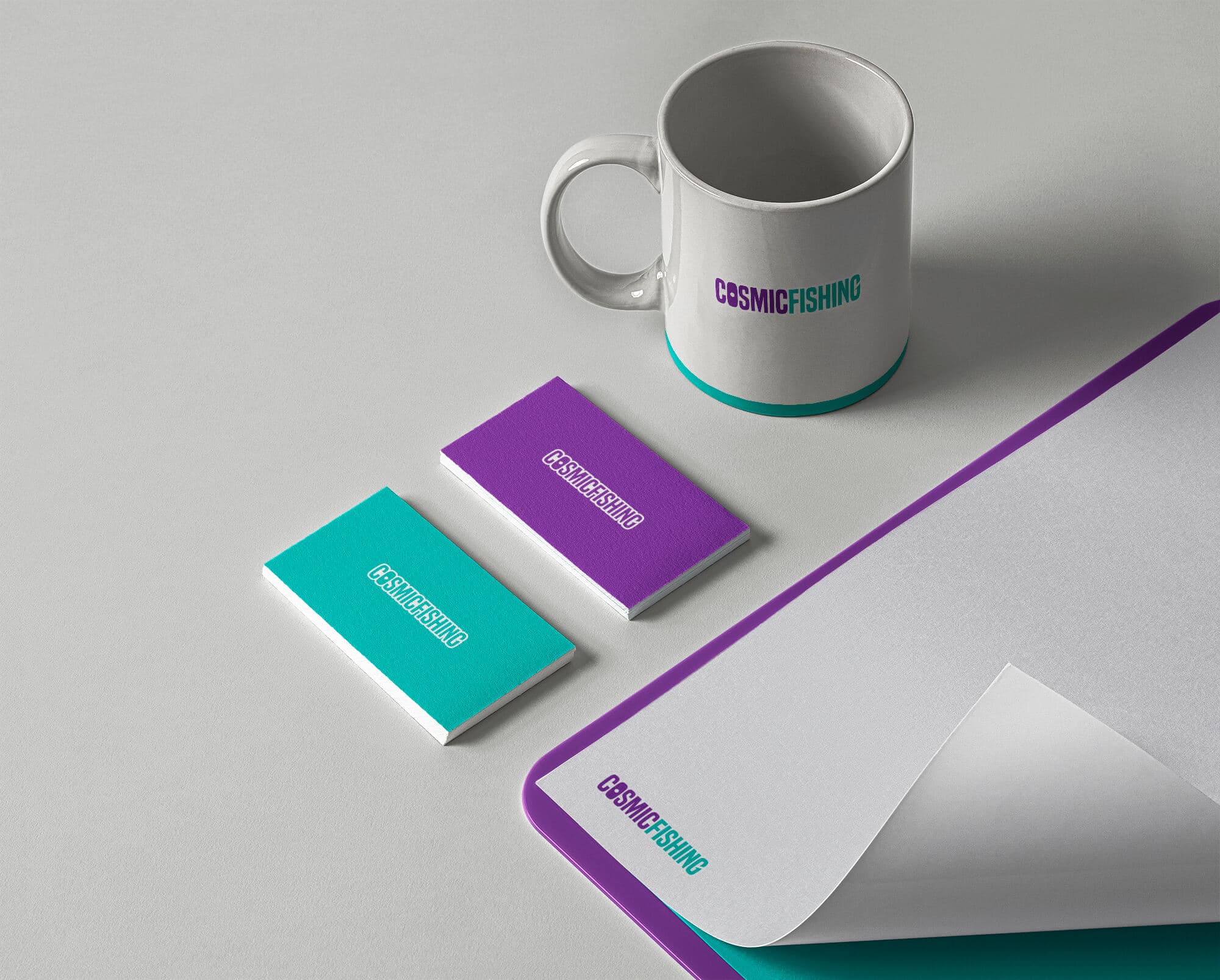
Cosmic Fishing Theatre needed a mark that could speak to an audience ranging from young children to adults without losing any professionalism. I designed a new logo that folds the company's name into its own symbolism — a planet nested in the O, a fishing hook curved into the G — paired with bold type, then extended that identity into the marketing and PR materials built to carry it.
Client overview
Cosmic Fishing Theatre is an experimental theatre company in the Waterloo Region, Ontario, staging plays and performances for audiences from young children through adults, with a mission built around intercultural, intergenerational connection through art.
Project scope
The brief was a rebrand: a new logo plus the marketing and PR materials to carry it, all built to capture the company's creative spirit while speaking to a genuinely broad audience.
Design concept
The logo does the heavy lifting, built around two symbols pulled straight from the company's name: a small circle nested in the "O" standing in for a planet, nodding to "Cosmic," and a curved hook shape worked into the final "G," nodding to "Fishing." Bold type paired with that restrained symbolism keeps the mark professional but distinctive, and flexible enough to hold up across every platform and material it needs to live on.
Brand identity