
Tixter
Client
Flixter
Services
UX/UI Design
Summary
A movie-ticketing app concept designed end to end — from user research through wireframes to a tested, high-fidelity prototype.
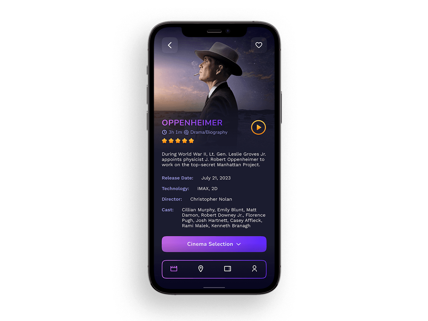
Most cinemas run their own standalone booking app, leaving nothing that covers every screen in town in one place. I led UX research and UI design to solve that: interviews and personas to pin down what moviegoers actually needed, paper and digital wireframes to explore the flow, and two rounds of usability testing that reshaped the booking screen, the seat picker, and the reserve-versus-buy decision before landing on the final prototype.
Project overview
The product
A mobile app for booking movie tickets at any cinema in town from a single place.
Project duration
March – May 2023, August – September 2023
My role
UX researcher, UX/UI designer
Responsibilities
User research and interviews, paper and digital wireframing, low- and high-fidelity prototyping, usability studies, design iterations.
The problem
Plenty of cinemas run their own standalone ticketing app, but nothing brings every cinema in the country into one place.
The goal
Research the apps already on the market, design a modern prototype, and validate it with real users.
The process
Research & Empathy
- Project overview
- Interviews
- Surveys
- Affinity diagrams
Analysis & Ideation
- Empathy maps
- Personas
- User stories
- User journey maps
- Competitive audit
- How might we?
- Crazy 8's
- Insights
Design & Prototyping
- Paper wireframes
- Digital wireframes
- Low-fidelity prototype
- Usability study 1
- Mockups
- High-fidelity prototype
- Usability study 2
- Animations
User research
Interviews and empathy maps surfaced two core user groups: working adults who just need a fast way to book or buy tickets, and teens and young adults who expect to handle everything from their phone.
Pain points
Separate apps
Some cinemas run their own ticketing app, but nothing covers every cinema in a single place.
Long lines
Nobody enjoys queuing — booking ahead of time sidesteps the problem entirely.
Lack of time
Many people don't have the time to keep up with new releases and trailers.
High prices
Ticket prices are steep enough that they keep some people from going as often as they'd like.
Personas
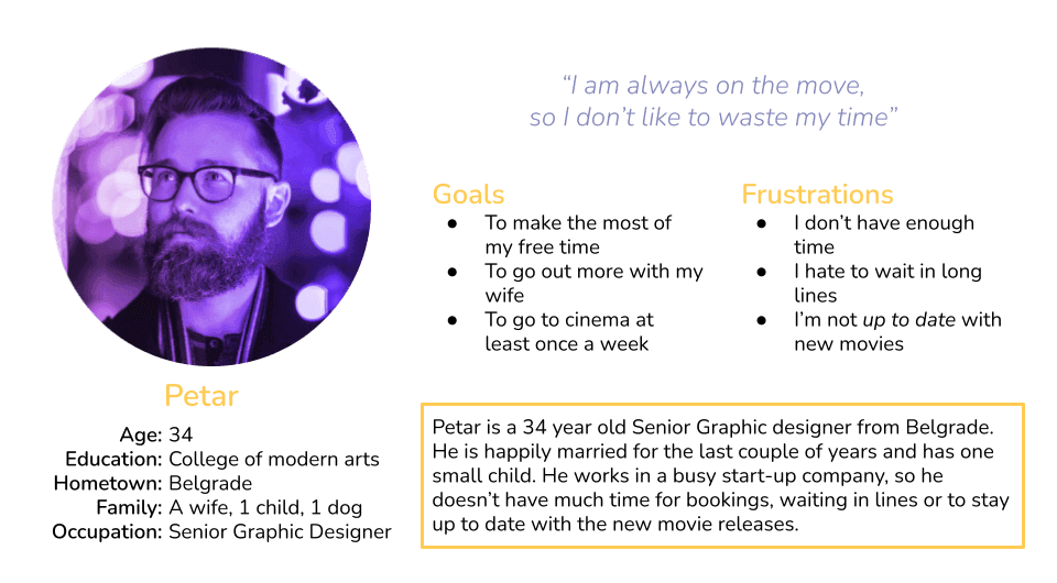
Petar
Problem statement
Petar, an adult man, is looking for a fast way to reserve or buy movie tickets — he'd rather avoid queuing altogether.
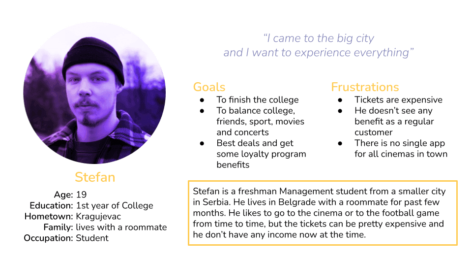
Stefan
Problem statement
Stefan, a young man, wants loyalty perks built in, since he finds ticket prices too steep as it is.
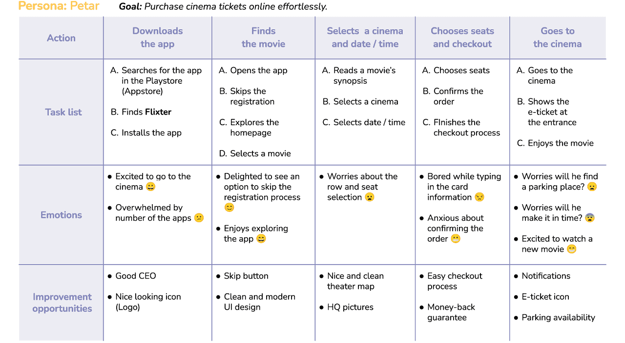
User journey map
Paper wireframes
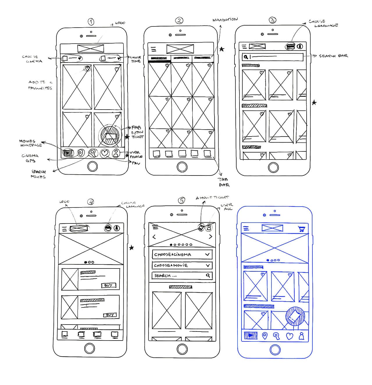
For the home screen, the priority was giving users everything they'd need in one glance: the latest trailers, a search bar for cutting through the catalogue quickly, movies grouped by genre, and a bottom nav that keeps every core action within reach.
I sketched several versions of the home screen on paper, then pulled the strongest ideas from each into one final layout.
Digital wireframes
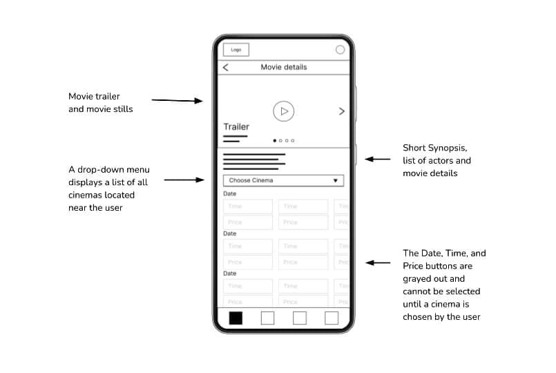
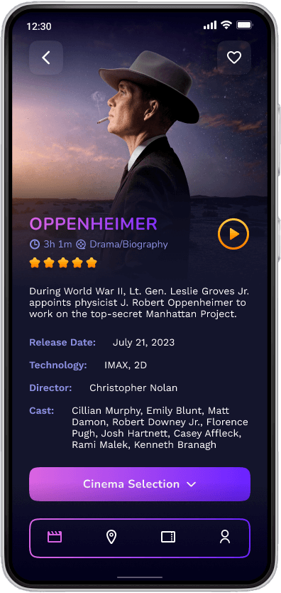
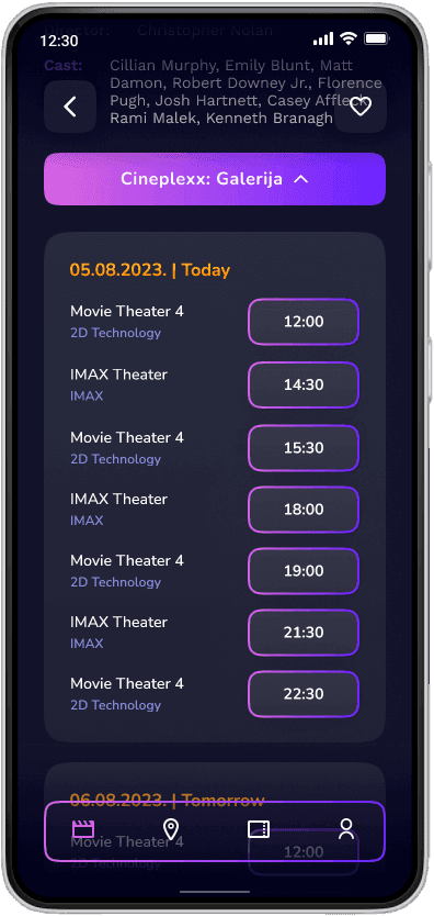
The movie page opens with the trailer and synopsis up top; scrolling down surfaces cinema, date, and time selection.
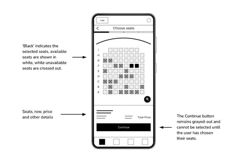
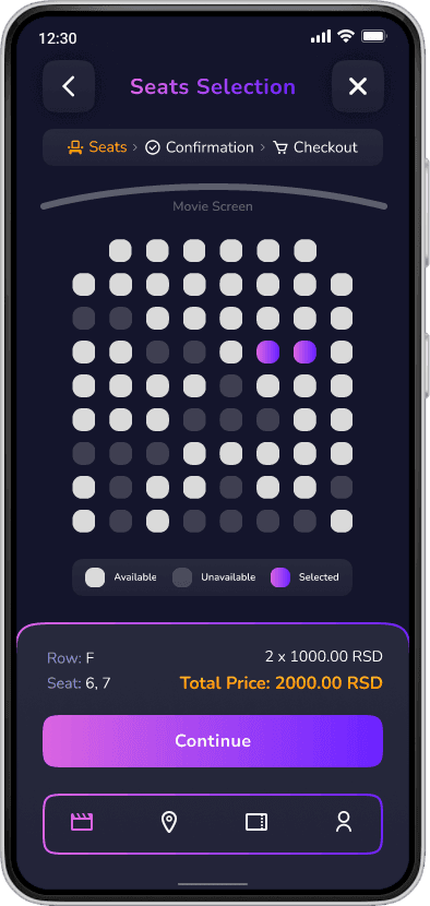
Once a cinema, date, and time are picked, the user taps through to choose their seats.
Low-fidelity prototype
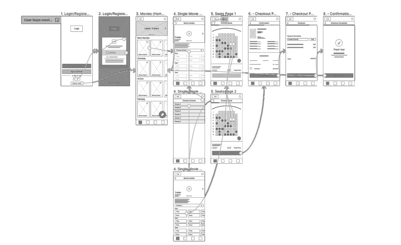
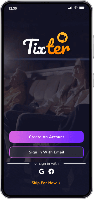
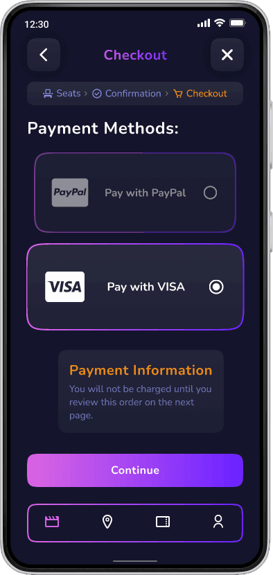
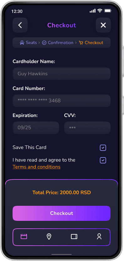
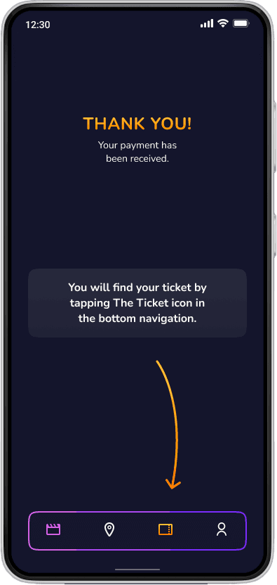
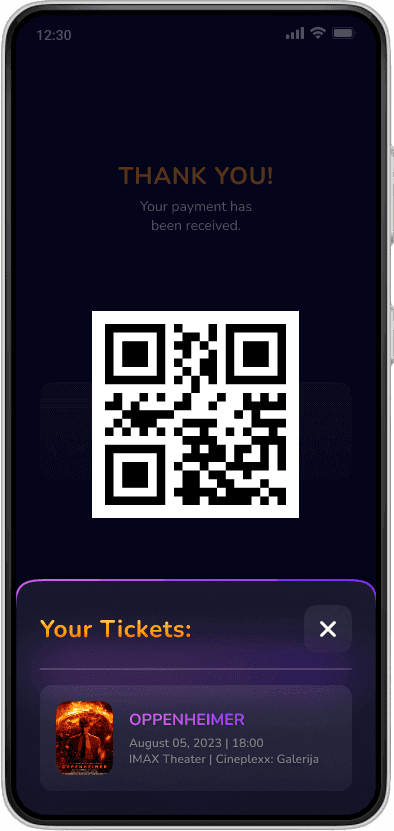
The flow starts with a Google sign-in, then lets the user browse movies, pick a cinema, date, and time, choose seats, and check out.
Usability study
After running the usability study, I gathered every insight from participants and grouped them by theme — five themes came out of it.
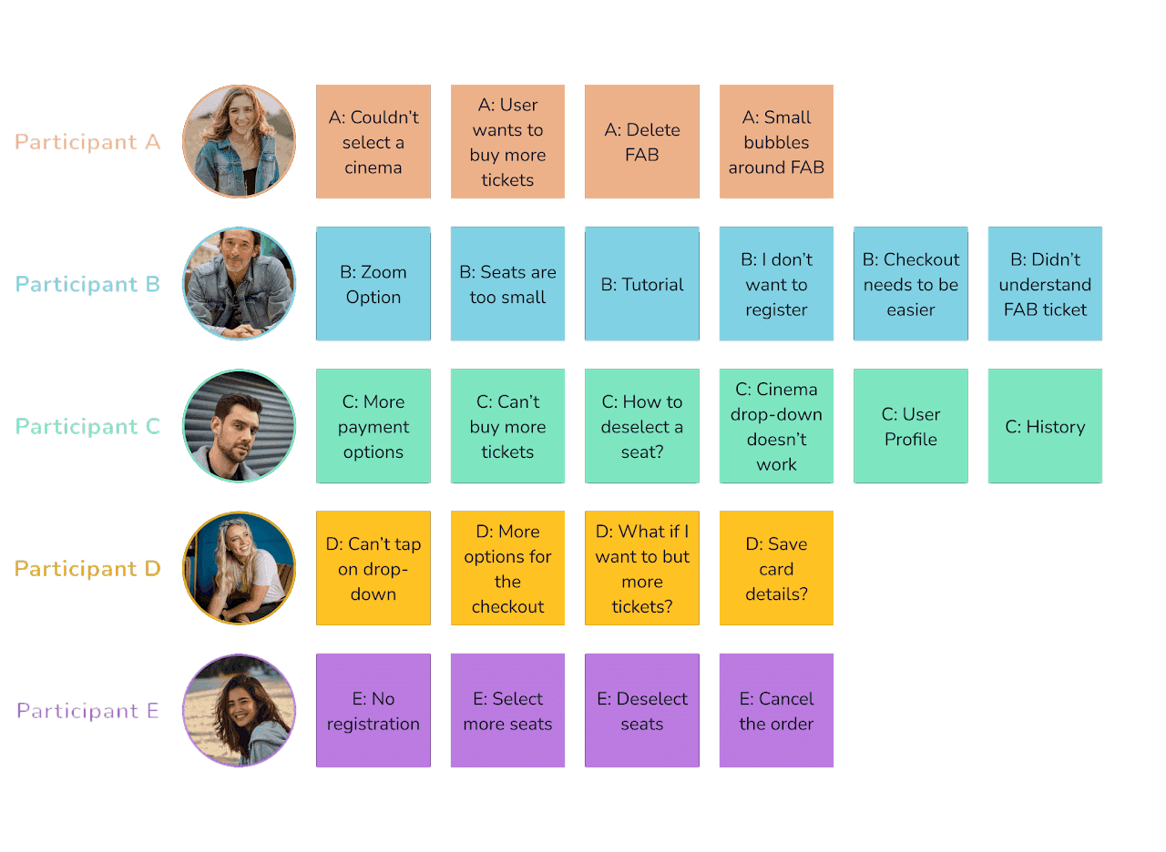

Themes were prioritized from lowest (P2) to highest (P0) impact before being folded into the next design pass.
Round 1 findings
- Users want to buy tickets for more than one movie at a time
- Users want a working drop-down menu
- Users want to skip registration
Round 2 findings
- Users want a reserve-and-pay-later option
- Users need a search bar
- Users want to be able to cancel an order
Mockups
Buying tickets for multiple movies
Users wanted to buy tickets for several movies in one pass, which led to two possible fixes — I added the option to build a small cart of tickets before checkout.
Before usability study
After usability study
Reserve and pay at the cinema
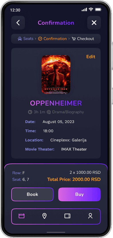
Some users wanted to reserve seats and pay in person rather than online, so the booking flow now offers a reserve-only path alongside the standard checkout.
Before usability study
After usability study
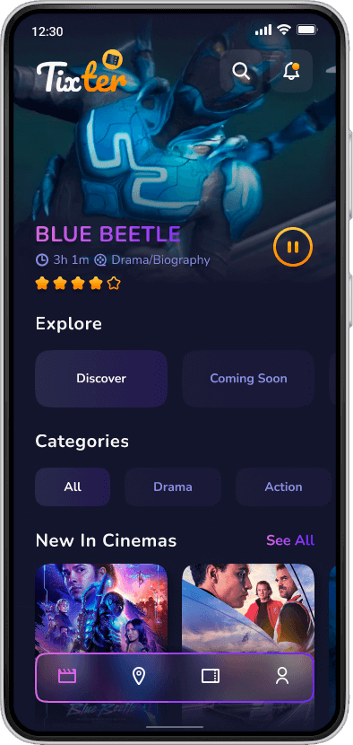
Mockups — userflow
High-fidelity prototype
The high-fidelity prototype is testable directly here.
Takeaways
Impact
“The app is fantastic! The user interface design is particularly appealing to me. It's both fun and user-friendly.”
A usability-study participant
What I learned
This project reinforced how differently distinct user groups approach the same product, and how much of that only surfaces once you sit down and actually talk to them.
Next steps
Design the user-account screen — profile details, favorites, transaction history, and preferences.
Build a cinema-locations screen where users can pinpoint their preferred cinema and get GPS directions to it, useful for visitors from out of town.
Add a notifications screen covering recent activity and purchases alongside new deals, news, and trailers.